Doctor EZ Scheduler
Designing a mobile app to help patients in scheduling or rescheduling their appointments, our app addresses the issue of patients having to constantly call the doctor’s office.”
→ Company: This is a fictional company to complete my Google UX course. DoctorEZ Scheduler is an app where patients can book their doctor’s office for appointments.
→ Role: UX/UI Designer
→ Communications with: Friends as “patients/users”
→ Tools: Pen & paper, Miro, Figma
→ Product overview: DoctorEZ Scheduler is a conceptual app designed to help patients easily schedule or reschedule their appointments without having to call the doctor’s office.
→ Problem overview: Busy patients found it frustrating to call the doctor’s office to schedule or reschedule their appointments while trying to find a time that accommodates both their schedules.
→ Main users: Patients
kickoff.
Please note: This is a fictional company to complete my Google UX Course.
Our company recognized that relying on patients to call in repeatedly to schedule or reschedule appointments was inefficient. Many patients had also requested the possibility of scheduling their appointments online. After receiving multiple requests, we decided to develop an application that allows our patients to easily schedule or reschedule their appointments online.
research.
To identify the issues faced by our patients, I conducted interviews with them. Some of the questions I asked included:
→ Tell me about a time when you were frustrated when rescheduling/scheduling an appointment.
→ When do you usually reschedule/schedule your appointment during your day-to-day?
→ How often do you forget to reschedule/schedule your appointment?
→ Why do you prefer rescheduling/scheduling an appointment online?
→ How often do you get the actual time/day you wanted when calling to schedule/reschedule your appointment?
→ What happens when you and the assistant can’t find a time/day that works for both parties?
insights.
I aimed to keep the questions open-ended to uncover any pain points. Here are some key insights I gathered from my interviews:
→ They dislike calling the office. It’s quicker for them to view the calendar directly and select a time that works for them, rather than waiting for the office to provide available options. They often find it frustrating when both sides have scheduling conflicts and end up spending a long time on the phone trying to find a suitable time.
→ Sometimes the patients get frustrated if they call the office and no one picks up. They then have to remember to call the office again before they forget.
→ Patients get frustrated when they have to wait in line because they’re on hold and not knowing how long they’ll need to wait.
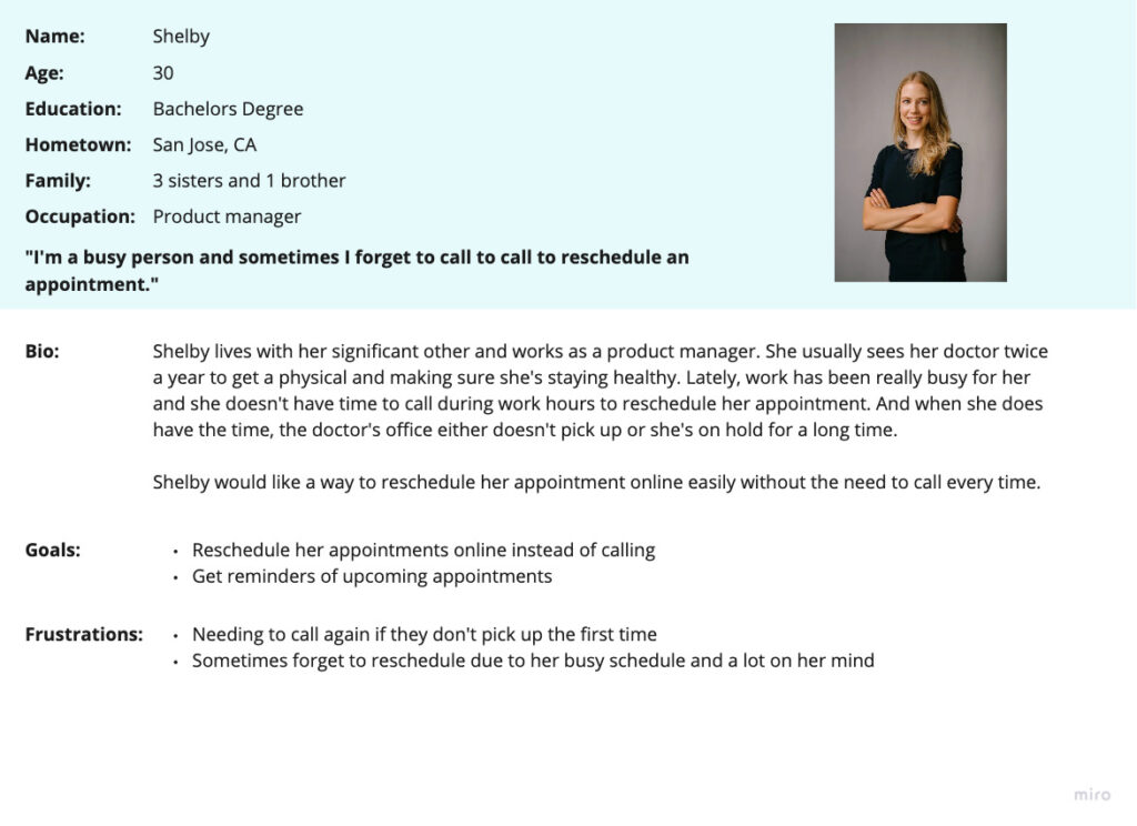
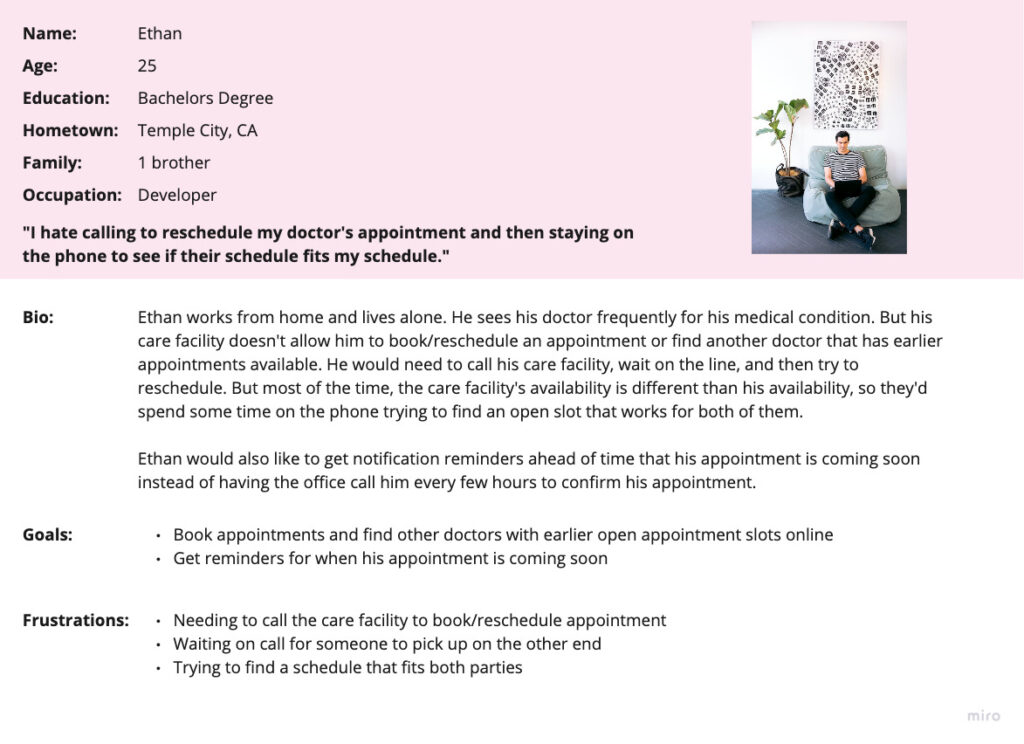
I then created user stories based on the personas:
As a busy employee who sees my doctor frequently, I want to book or reschedule my appointment ahead of time, so that I can effectively manage my schedule online instead of calling and waiting.
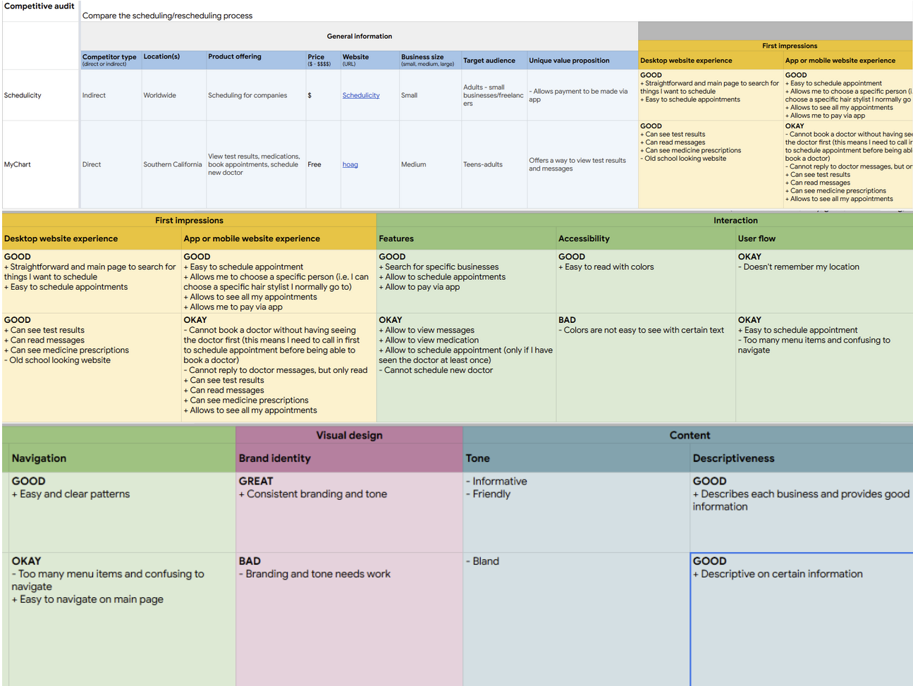
Before moving further, I wanted to see what the competition offers, so I created a competitive audit:
define.
After researching interviews, I created their current user journey to discover any pain points and gaps within their flow that could be improved.
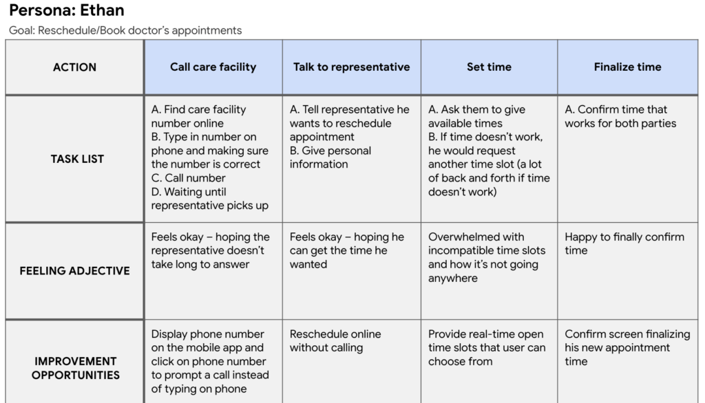
To focus on the problem statement:
Ethan is a patient who often sees his doctor and would like an way to easily schedule/reschedule his doctor’s appointment because he dislikes calling the office every time he needs to adjust his appointment.
ideate.
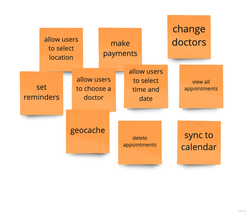
Now it’s time to focus on the main problem of “Our doctor’s app will allow users to schedule/reschedule their appointments which will affect busy patients. But how do we do that? How might we create a scheduling app that will help patients? How might we help reduce patients’ time from calling the office every time they need to reschedule/schedule an appointment?
design.
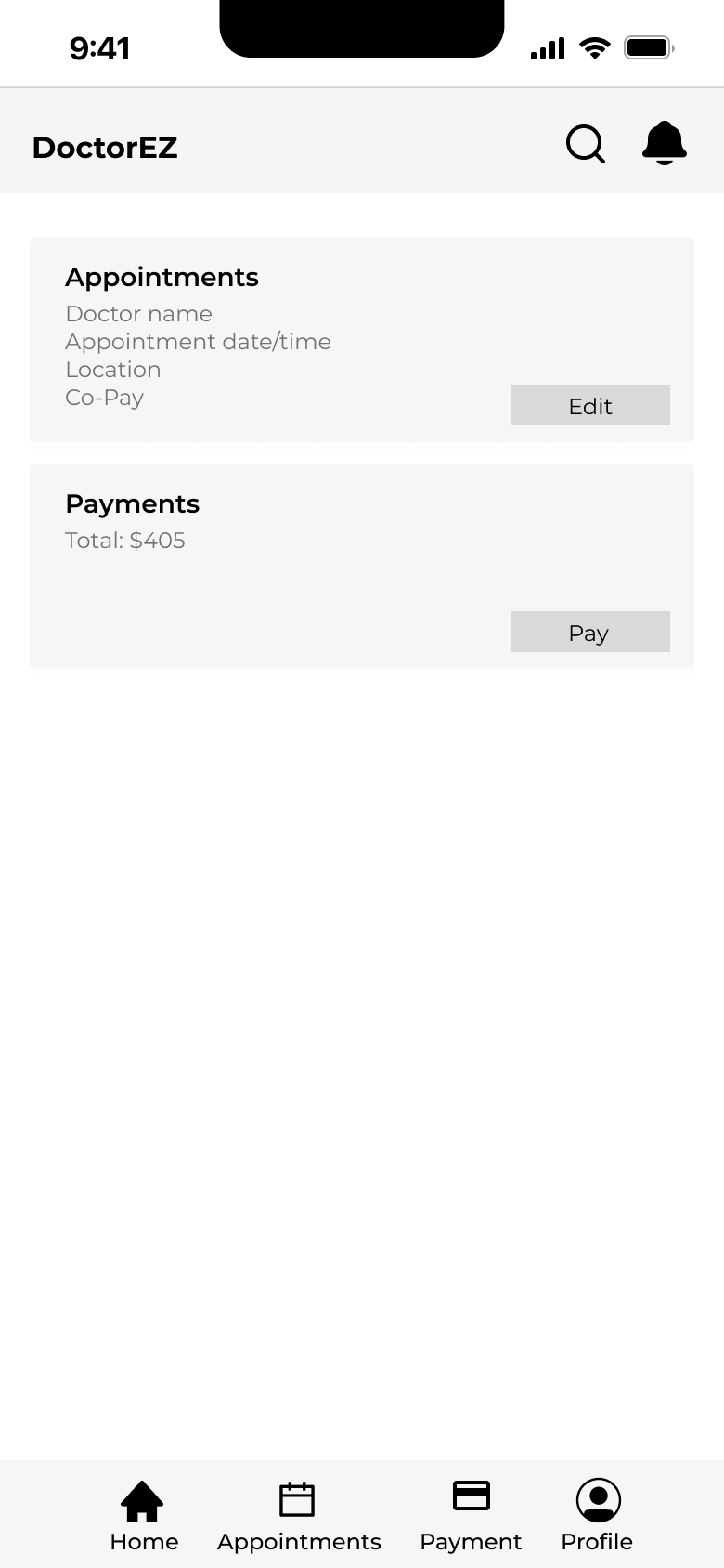
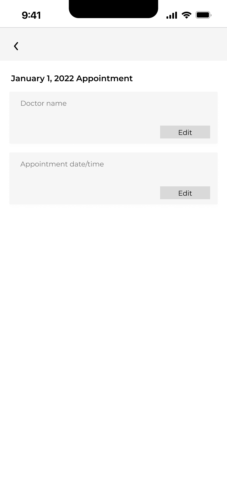
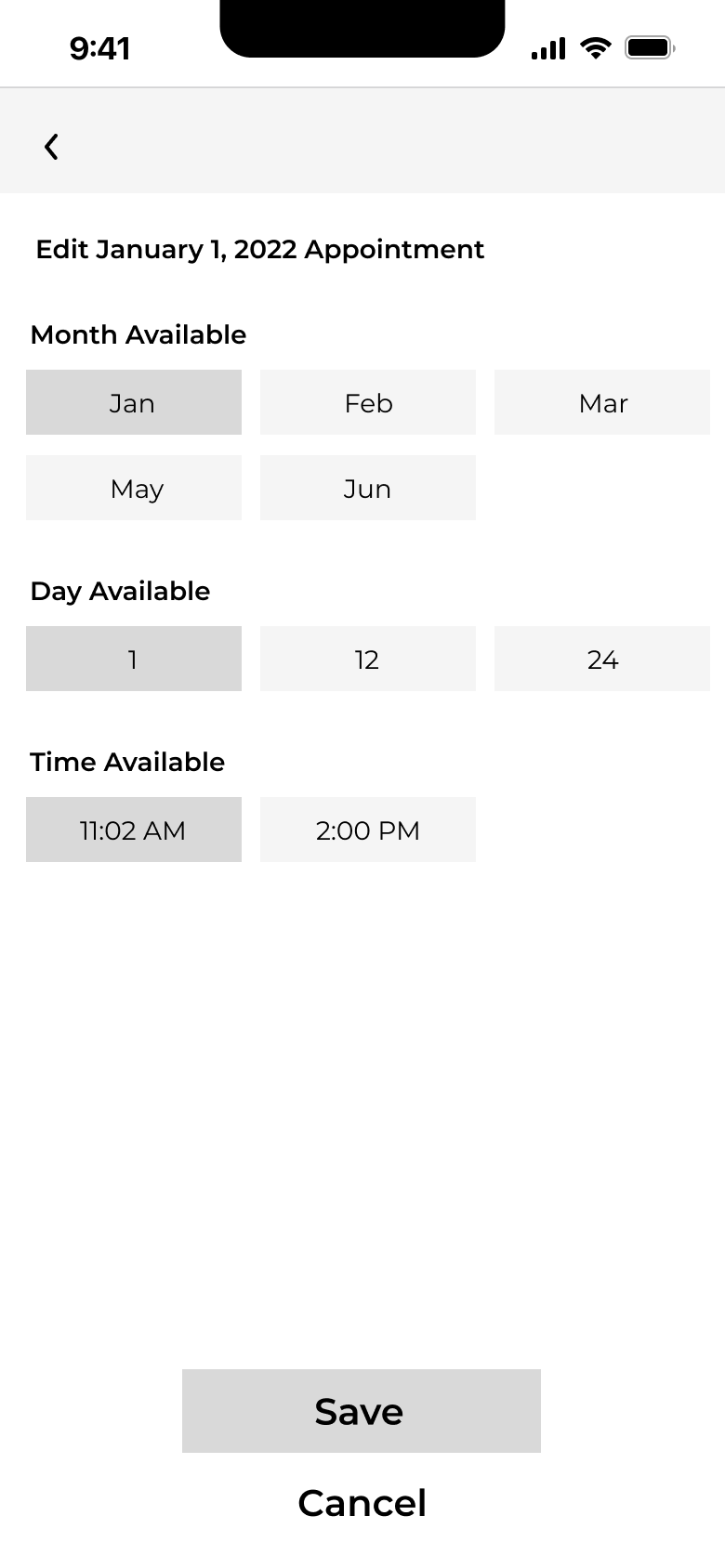
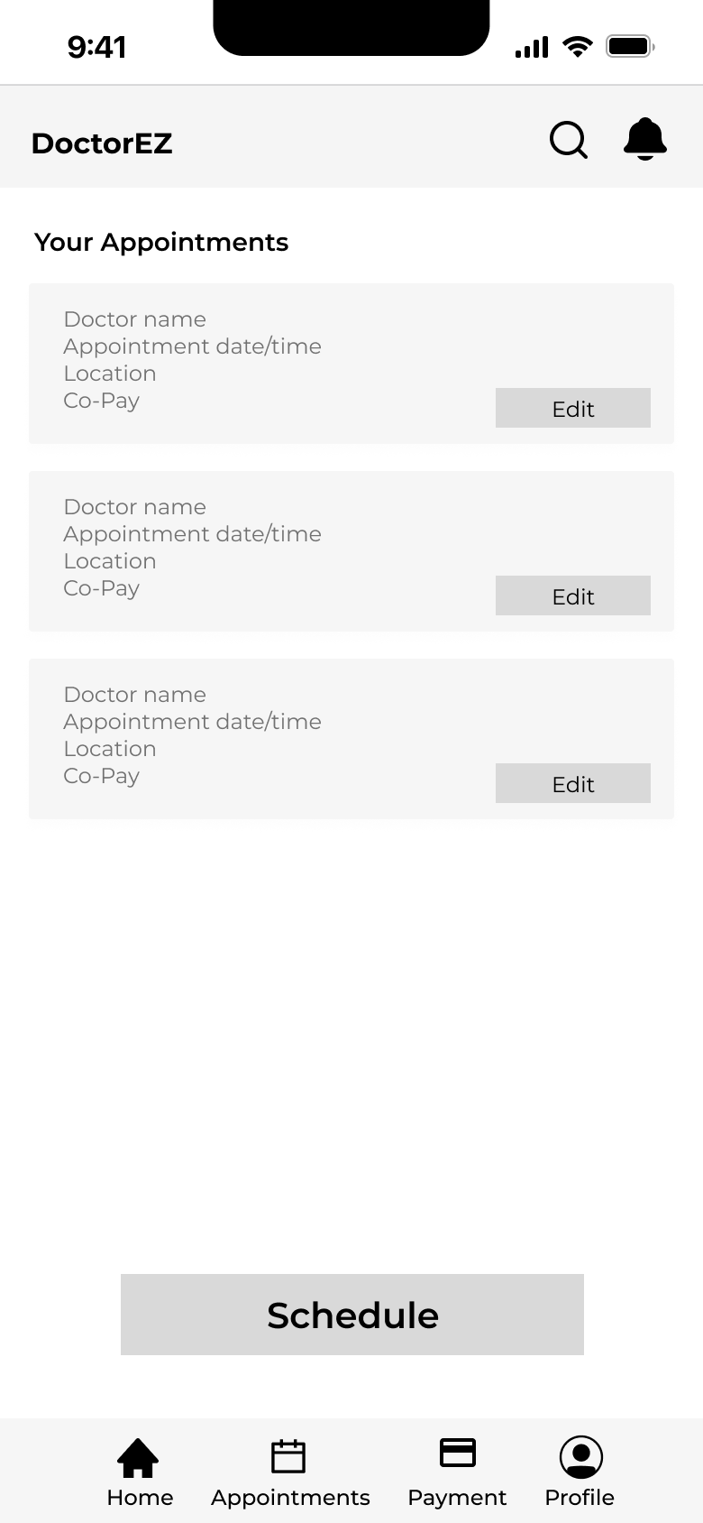
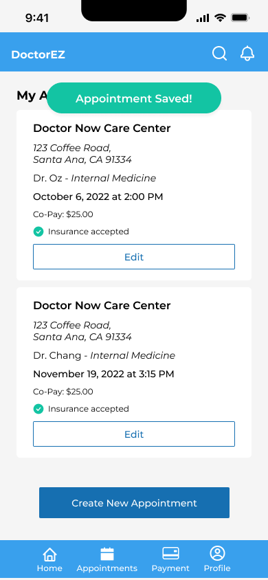
Next up is wireframing! I began creating low-fidelity wireframes and prototypes. Our initial designs focused on allowing users to view their active appointments and then enabling them to either reschedule an active appointment or schedule a new one. I set up user testing around this straightforward flow, specifically targeting the goal of rescheduling an active appointment.
test.
I received feedback regarding the lo-fi user testing and noted the following:
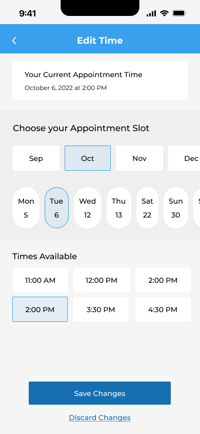
→ The patients would like to see the actual weekday (e.g. Monday, Tuesday, etc.) instead of only showcasing the days because sometimes they prefer a specific weekday. If they were to only look at the days, they would still look at a calendar to make sure what day that weekday is on.
→ The patients would like to know their current appointment time when rescheduling so they can keep in mind their current appointment time.
→ The word “Cancel” was confusing as to whether they are canceling the appointment, or only canceling the changes made to the appointment.
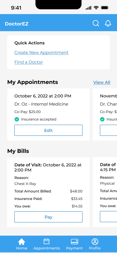
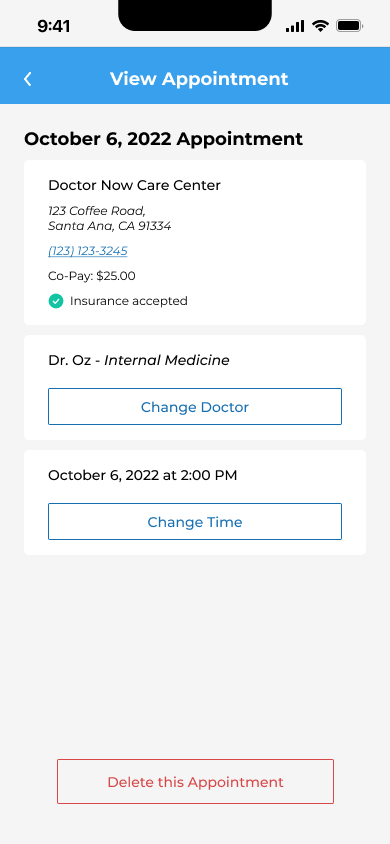
After the feedback, I made changes to the wires:
key learnings.
Even though this project was fictional, being able to interview friends and get their feedback has helped along the process.
Too long; didn't read (tl;dr)
DoctorEZ Scheduler is a fictional application where patients would like a quick way to schedule/reschedule their appointments. The problem is when patients need to constantly call the doctor's office every time they want to adjust their appointments and then wait on the phone trying to find a time/day that fits both parties. This increases the patient's time of looking up the phone number, calling, being on hold, and going back and forth on an appointment time. The goal was to decrease patient's time by creating an online application that allows them to schedule/reschedule their appointment with ease.