Upper Supplies Website
Too long; didn't read (tl;dr)
Upper Supplies is a B2B company selling eco-friendly cups, plates, bowls, and more. The goal is to simplify the process when browsing product catalogs and requesting quotes. The website will solve the businesses’ problem of making it user-friendly by giving them a new website with clear, detailed product information and an easy-to-navigate interface.
“Effortless quotes at your fingertips – simplifying the way wholesale businesses connect and grow.”
→ Company: Upper Supplies is a B2B company selling eco-friendly cups, plates, bowls, and more.
→ Role: UX/UI Designer
→ Communications with: Developer and CEO
→ Tools: Figma
→ Website: https://uppersupplies.com/
→ Product overview: Upper Supplies Website provides businesses with an easy way to explore their range of products and request personalized quotes tailored to their needs.
→ Problem overview: The client wanted to create a new website where businesses can browse their products and request quotes.
→ Goal: In order to simplify the process when browsing products and requesting quotes, our website will solve the businesses’ problem of making it user-friendly by giving them a newly designed website with clear, detailed product information and an easy-to-navigate interface.
kickoff.
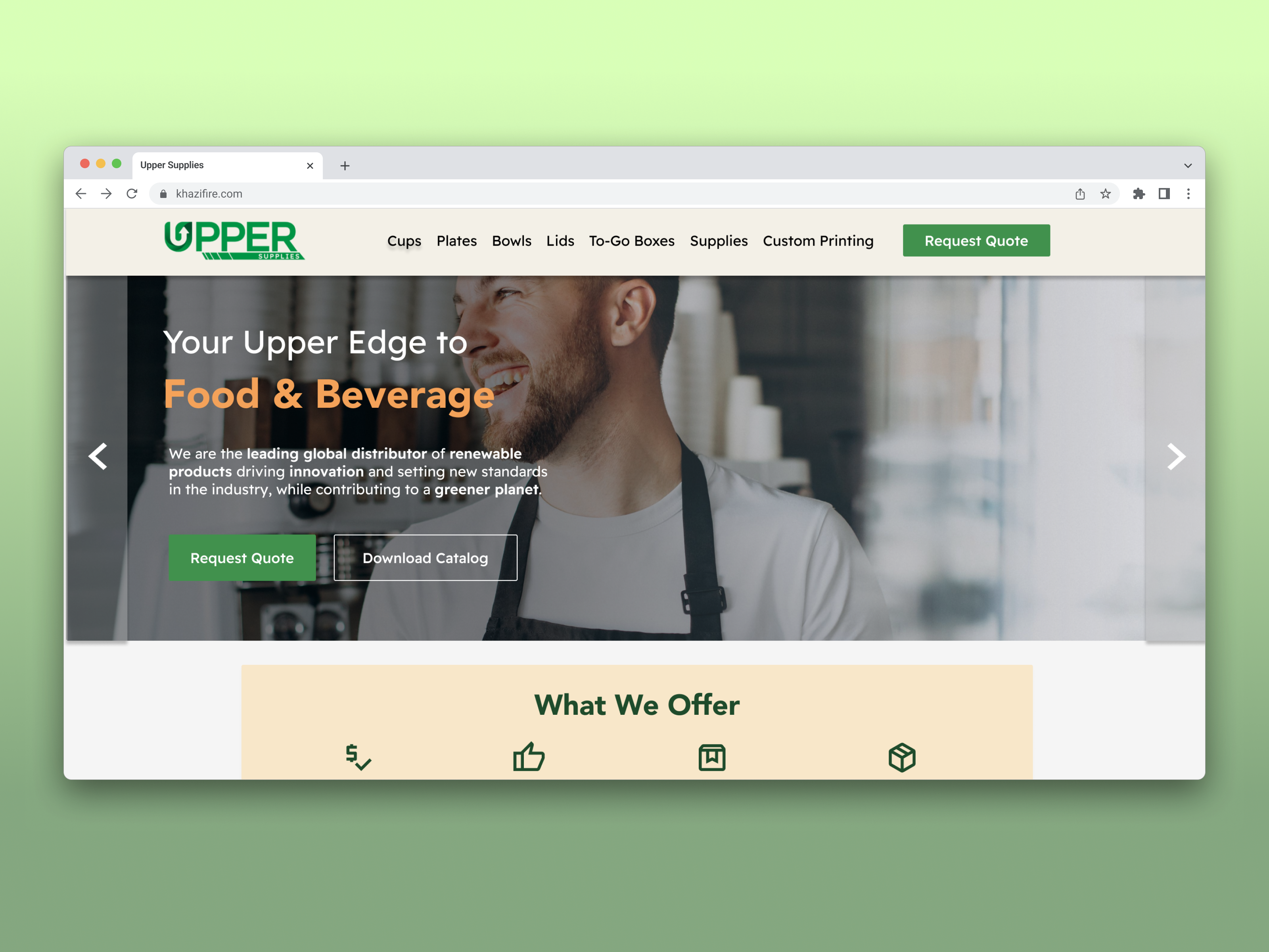
The client wanted a website design that aligns with their branding and provides a user-friendly experience, allowing businesses to easily navigate, browse, and request quotes. The site focuses on B2B sales of eco-friendly products, such as cups, bowls, plates, and more.
research.
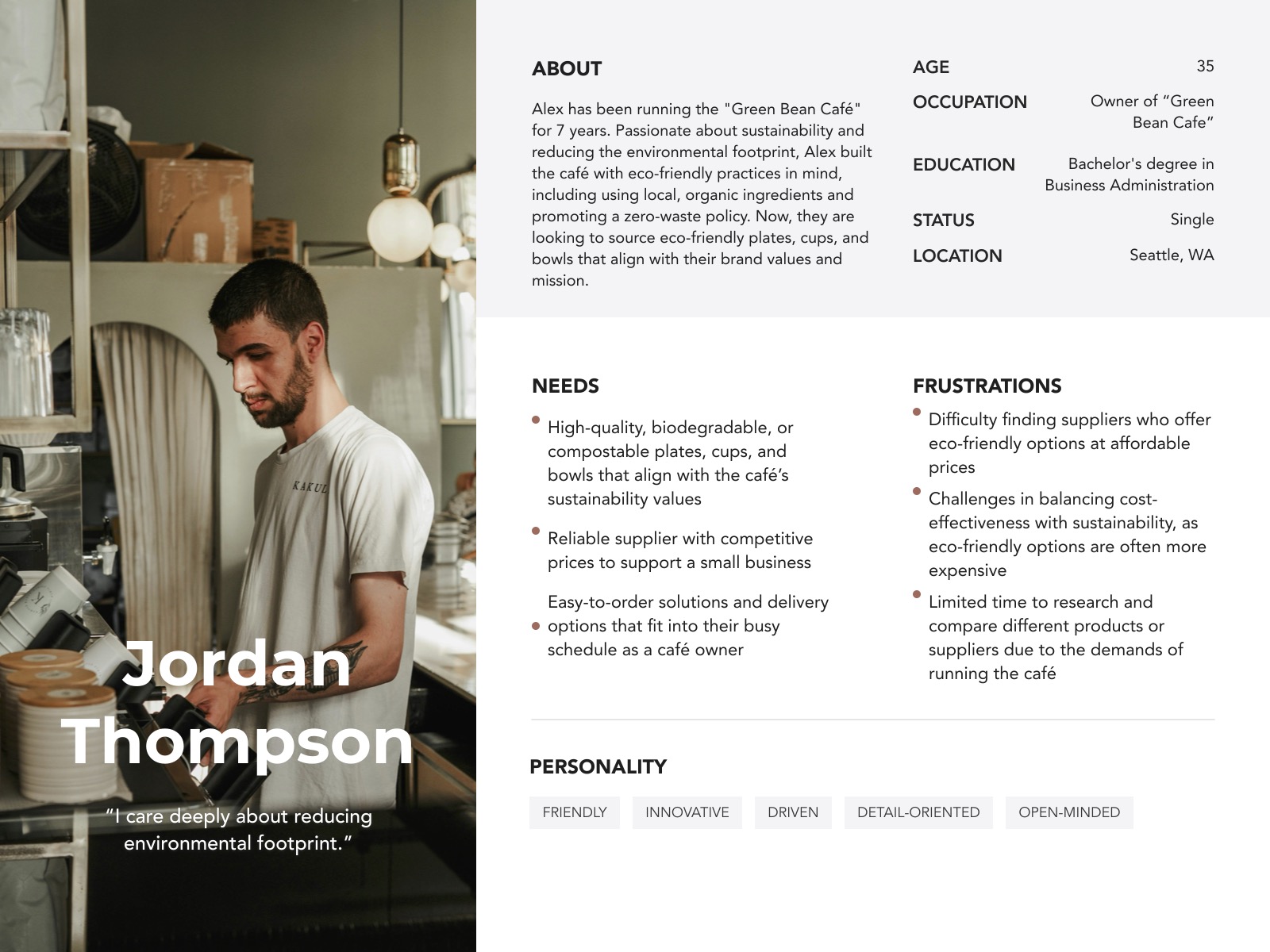
Given the timeline and budget constraints for client research, I did not have access to real research insights. All the research presented below is based on assumptions.
insights.
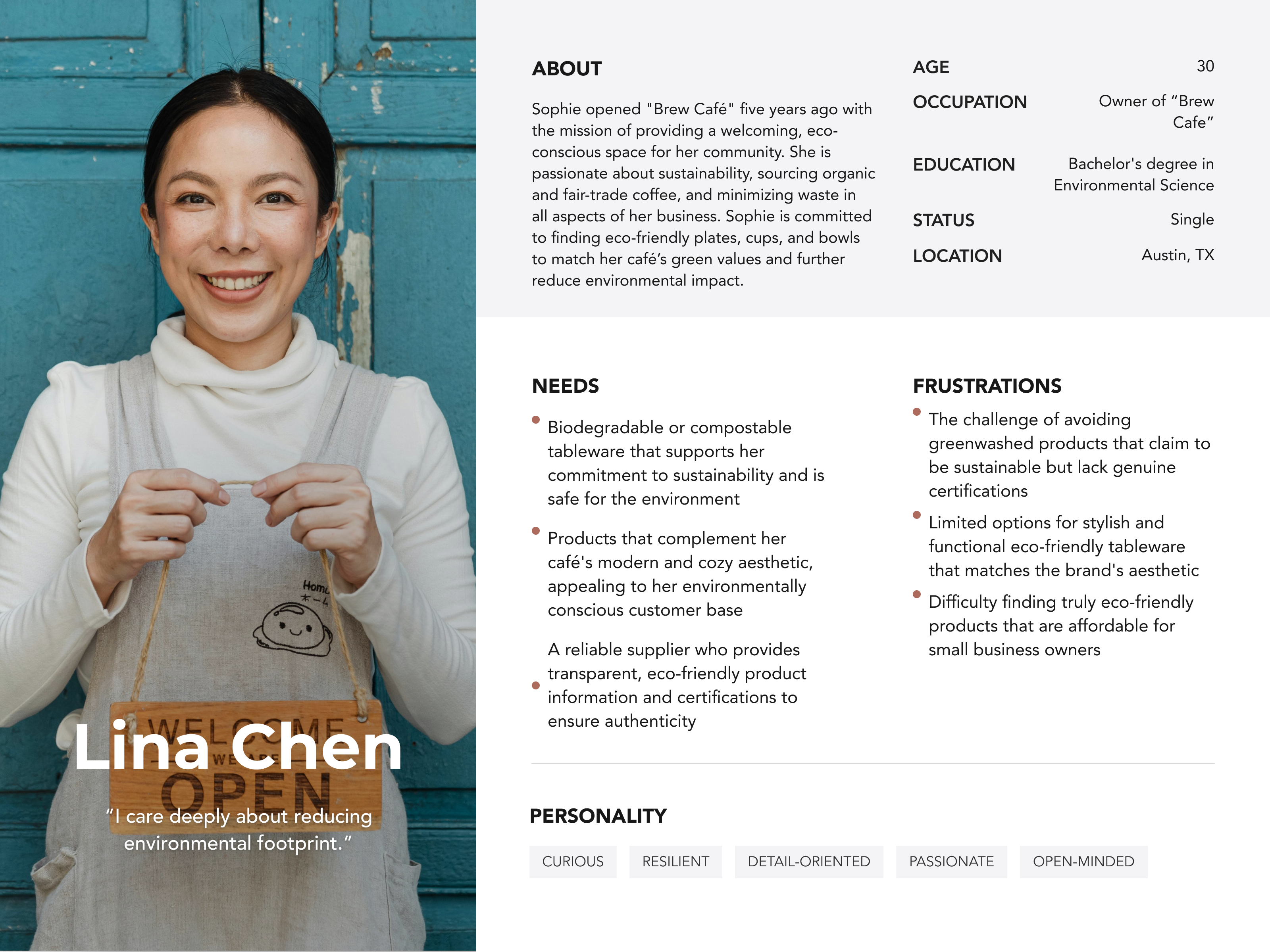
Using proto-personas, I identified the needs, goals, and behaviors of users.
define.
I then created a user journey to identify pain points in the process, from when businesses begin searching for an eco-friendly product supplier to when they start requesting quotes.
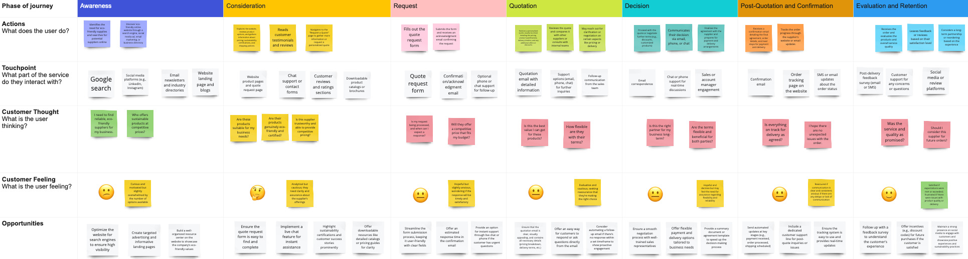
Pain points consist of the following:
→ Users may feel overwhelmed by the number of suppliers and eco-friendly options through their research
→ Not seeing upfront pricing and certifications on whether the supplier does have eco-friendly products
→ Quote form needs to be easy to fill out
→ Concerns about how fast the supplier will get back to the user after quote form submission
→ Concerns about product quality
ideate.
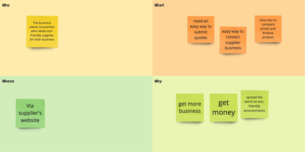
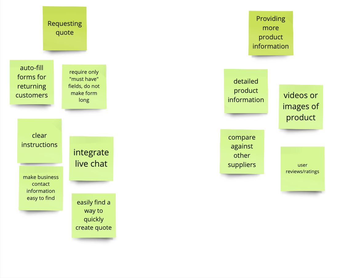
Now to focus on the problem of “Business owners seeking eco-friendly supplies face challenges in navigating the online quote request process due to overwhelming choices, a lack of clear information, and uncertainties regarding response times and quote details.”
How might we help make the request quote process easy? How might we provide more information regarding our products?
design.
As I started building high-fidelity wireframes, I made sure the website was easy to use, especially when requesting a quote. The choices I made were:
→ Colors: Green and brown colors to signify earthy-tones. Green symbolizes nature and growth, and brown symbolizes warmth and natural materials. These color combinations provide an eco-friendly ‘feel’.
→ Buttons: Call-to-action buttons “Request Quote” as that is one of the main goals targeting our users. We want the main button to get user’s attention.
→ Product Details: Product catalog was added to the website so users can find all the product details such as SKU, images, names, and more.
→ Request Form: Simplified the request form to capture only essential information, ensuring that users don’t have to fill out lengthy forms that could discourage them from requesting quotes
key learnings.
Creating a design without access to real data or insights from actual users creates some challenges. When relying on assumptions, it can lead to a misalignment between the design and the actual needs of users, resulting in a product that may not effectively address their pain points or preferences.
While these assumptions can offer a different perspective and serve as a starting point for the design process, they are inherently limited. They may highlight potential areas of focus, but they cannot replace the valuable insights gained from direct user feedback and interaction.